BRAND IDENTITY & BRAND APPLICATIONS
A boutique fitness studio.
Year: 2022
Industry: Fitness & Wellness | Pilates & Functional Training
Scope: Developed the brand identity and digital experience for HAROBED, a conceptual boutique fitness studio combining the strength, endurance, and functional movement of TRX training with the precision, flexibility, and mind-body connection of Pilates.
The creative vision was to build a distinctive fitness brand that balances strength and fluidity, creating an energetic yet welcoming experience for people of different fitness levels. The project included brand strategy, visual identity, logo design, color palette, typography, graphic patterns, environmental branding, signage, merchandise, and a cohesive system of digital and physical brand applications.
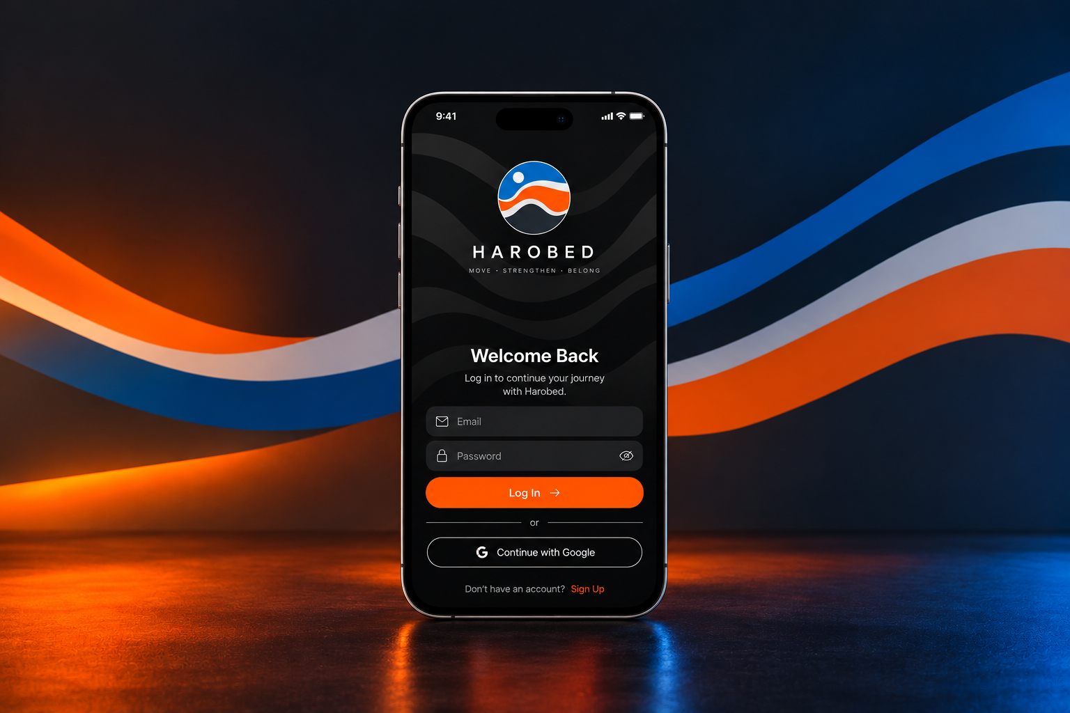
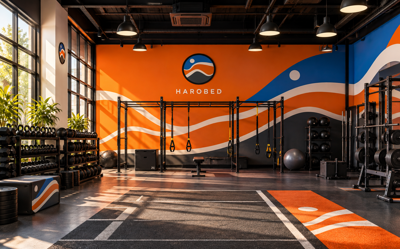
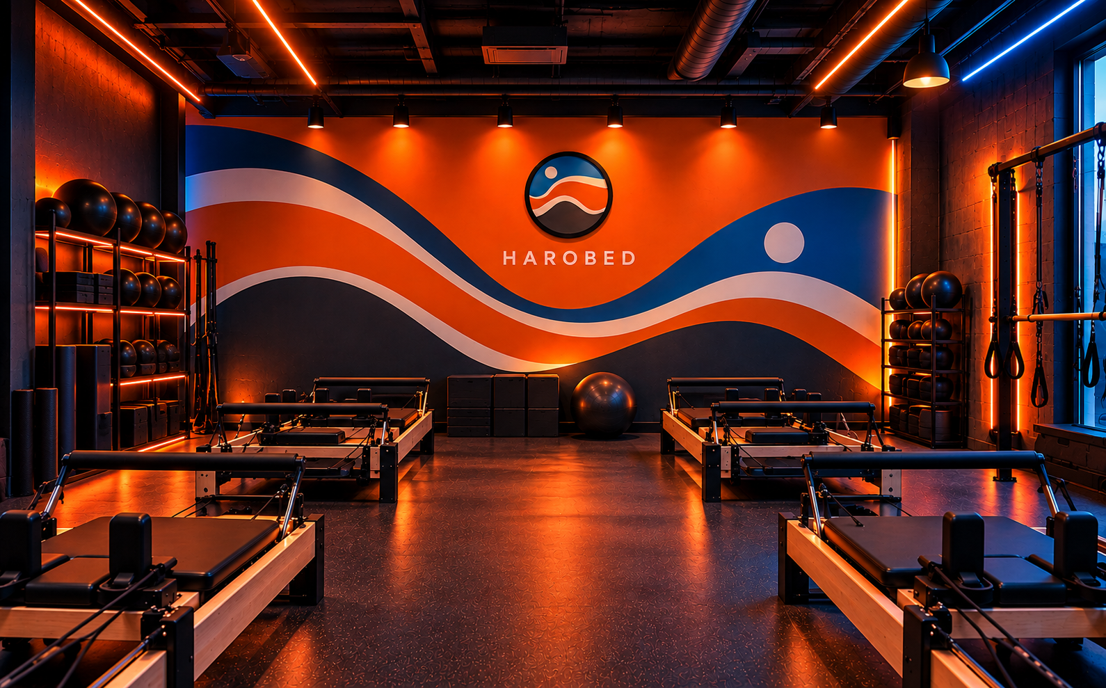
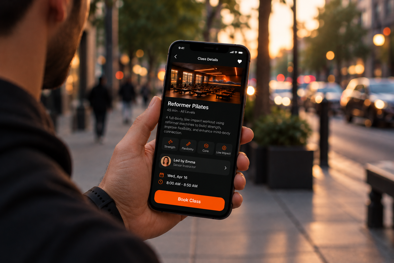
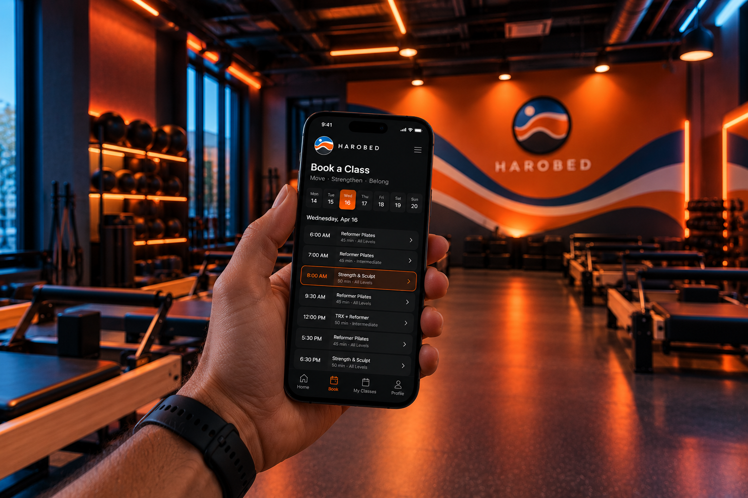
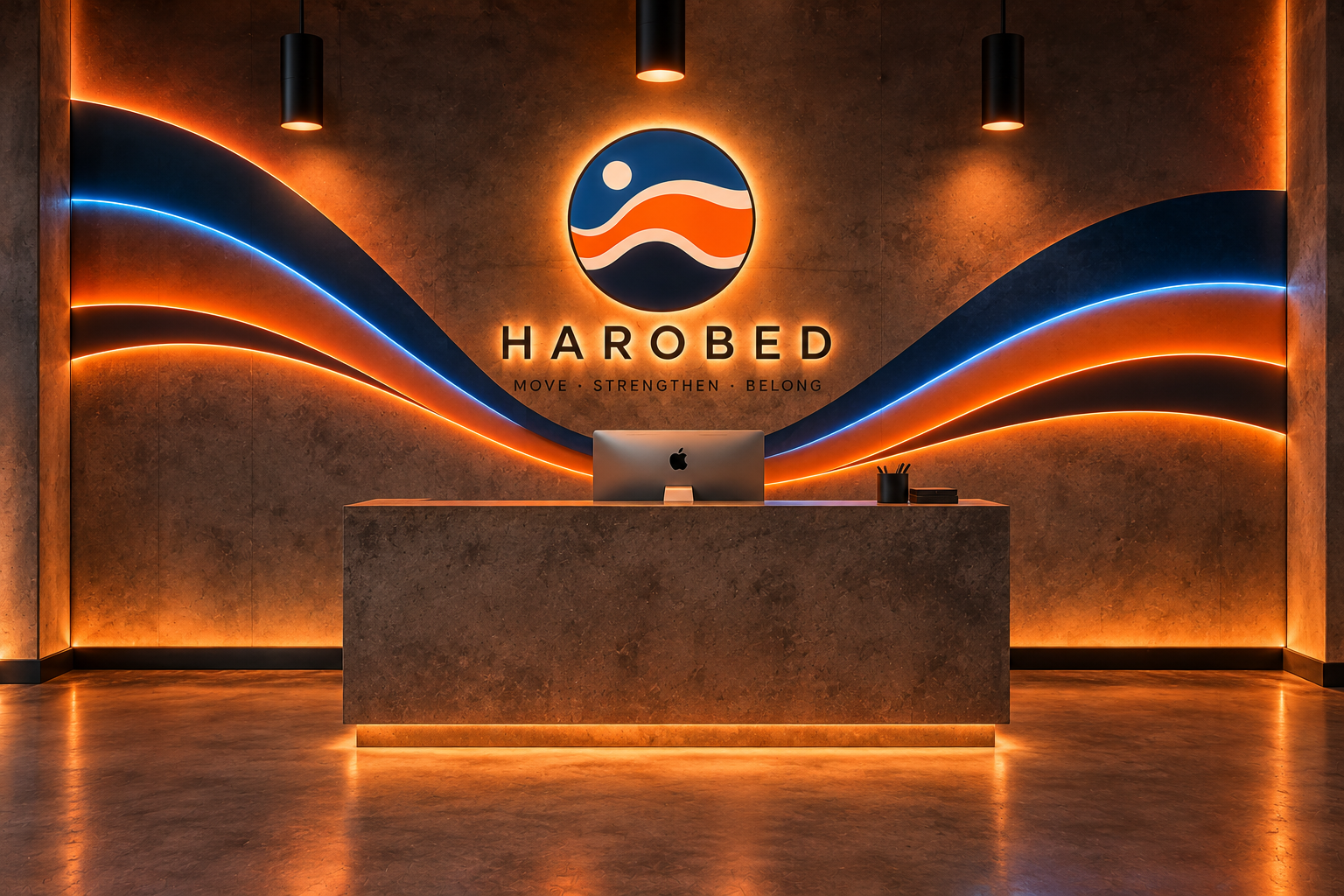
The concept extended into the studio's interior environment, where industrial textures, dynamic graphics, and vibrant lighting bring the identity to life. The digital experience included a mobile app concept designed to simplify class discovery, scheduling, and booking, connecting the brand experience from the first digital interaction to the physical studio.
Role: Brand Strategy & Identity, Creative Direction, Visual Design, Environmental Branding, Digital Experience, App UI Design & Brand Applications
Applications
For HAROBED, I developed a brand concept around the idea that strength, movement, and mindful fitness should feel accessible and appealing to everyone. The creative challenge was to bring together two complementary yet traditionally distinct fitness disciplines—TRX, associated with strength and functional performance, and Pilates, a practice often marketed toward women—into one cohesive experience that would resonate equally with men and women. The goal was to challenge conventional perceptions of Pilates and create a fitness identity that feels powerful, contemporary, inclusive, and welcoming without losing the precision and balance at the heart of the practice.
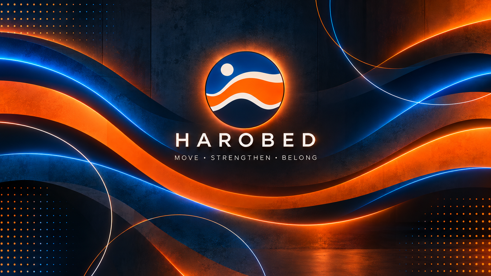
The visual identity became an exploration of strength in motion. Bold orange and electric blue create a dynamic contrast that communicates energy, confidence, and performance, while fluid, interconnected shapes inspired by the logo reflect movement, flexibility, and the balance between strength and control. Clean geometric typography, rhythmic patterns, and expressive graphic elements establish a distinctive visual language that feels athletic and modern without leaning into traditionally masculine or feminine fitness aesthetics.
Across the environmental design, studio signage, merchandise, digital applications, and mobile booking experience, I extended this visual system into a cohesive brand ecosystem. Industrial textures, dramatic lighting, and vibrant neon accents give the physical studio a bold, immersive personality, while intuitive digital interfaces make discovering and booking classes feel effortless. The result is a contemporary fitness concept that brings the power of TRX and the precision of Pilates together under one inclusive identity—redefining what a modern movement studio can look and feel like for everyone..